
You often need to make signs for road navigation, making it easier for people to get to their destination or for other purposes. This is why you need to choose appropriate and readable fonts for signs.
It is important to ensure that the fonts for your chosen signs are legible over long distances. Avoid cursive or other fonts that are too dramatic. Instead, you want sans serif, serif, display, and other fonts that are bold, clean, and simple.
You don’t have to worry if you’re still confused about what fonts go well with signs because you’ll find some recommendations here. To be clear, here are the recommendation fonts for signs you can choose and consider!

The first choice is Nolaten, especially for elegant sign fonts. It’s a subtle serif font that’s neat and easy to read, even if you’re far from the text.
The feel is classic and elegant, with a more formal impression. Uniquely, this font will not make the writing feel stiff. It is suitable for those of you who want to make any sign, especially a sign that next few kilometres, there is a shop t in the next that needs attention.

If you want letters that are more assertive yet playful, Broseki is the answer. This sign font combines elegance and modernisation, making it look formal and professional.
However, this aesthetic font also has a charming twist, as it is witty and adorable. It’s perfect as a sign font for jewellery brands, property or hospitality businesses, and other brands with a primarily female target market.

Drafbink is a blend of classic serif fonts with modern serif fonts. This makes it look formal and informal at the same time. Of course, without forgetting the fact that this font feels elegant.
The typography also looks unique, with a series of letters that are bold and full. This is what makes it ideal as one of the fonts for signs. So, you can still read it from a distance, considering the typography of this font is very eye-catching.
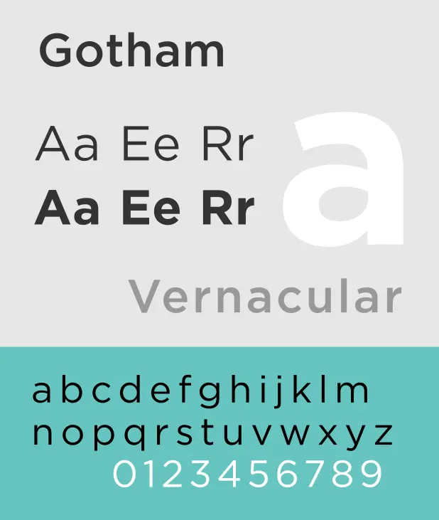
The word that best describes Gotham is simple, but that’s where it comes in. Its simplicity is perfect for a sign because it’s easy to read. The letters are not too big with a clear, bold, and unobtrusive gesture.
Interestingly, you can get this font for free in most editing apps. On the plus side, you can use it for free without paying. However, on the downside, this sans serif font is too common and not exclusive. Although not unique, Gotham is still suitable as one of the fonts for signs.

Broadly speaking, Garamond is still a serif font. However, a touch of old style makes it look even more attractive. This font is also free but common. You will find it in many novels, poems, and others.
Other than that, you can also use Garamond for signs. The typography is very neat and firm. However, make sure you write it in bold mode.

Another classic serif font option that you can consider is Trajan. This font is neat and bold simultaneously, especially if you write in bold and capital letters. It is best suited for posters and signs.
As one of the fonts for signs, all letters are available in capitalised form. If you want to write the initial letter of Caplock, then Trajan provides a larger size than regular letters.
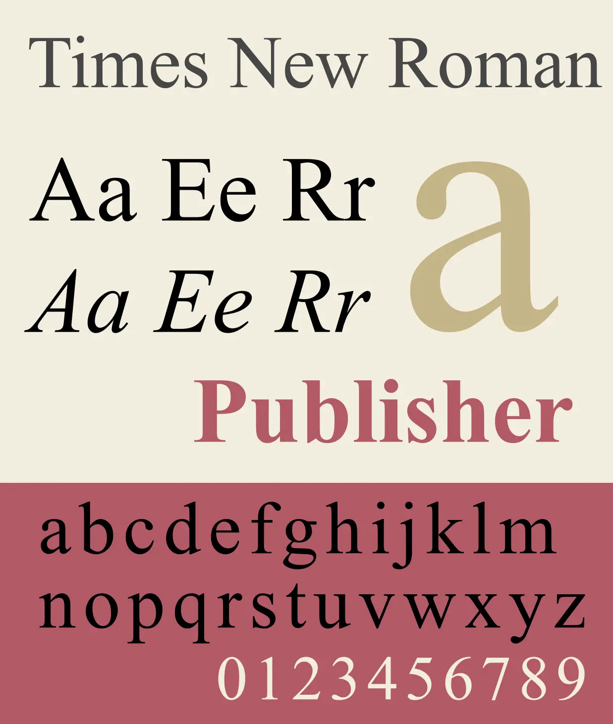
If you believe in ‘classic is best’, then Times New Roman (TNR) is the answer. The writing is very neat, firm, and normal. It’s so neat that almost everyone chooses this font for almost any situation, including for signs.
Not only suitable as a font for scientific papers, TNR is the mainstay of all people to make clear and straightforward posters. No wonder TNR is one of the most frequently used sign fonts.
If you are confused about which font to choose for your sign, Twinletter is the best choice. It offers a wide selection of the best premium fonts that are unique, interesting, and anti-mainstream. The choice can be adjusted to what you need!
On Twinletter there are many premium and licensed fonts for signs. Your signs are guaranteed to be unique and memorable.
