
In the process of selling products, producers must pay attention to the target market, sales location, type of promotion and several other marketing elements. But did you know that typography for packaging should also be given the same portion of attention?
Typography in packaging is a creative way to combine ideas and provoke market reactions. Successful typography indirectly builds a product’s branding.
To better understand what typography for packaging is, please refer to the details below.
Typography for packaging is a design created specifically for use on a product’s wrap or packaging.
Meanwhile, according to the Big Indonesian Dictionary, typography is a technique for organizing text and letters so that they have an easy-to-read but still attractive appearance.
Product typography in packaging is expected to influence potential consumers’ behaviour. The design must fulfil the principles or elements of Typography for packaging so that it can bind potential consumers’ emotions.
For this reason, producers need to pay attention to selecting font types and sizes with the right art and techniques.
Examples of typography for product packaging that are successful in the market include:

You must be familiar with this brand of electronic and communication equipment, which has the icon of a bitten apple.
The selection of letterforms or fonts from the Apple brand is very simple but elegant. The font shape also looks clean and neat. But it is precisely from this kind of font shape that the character of premium-quality products that want to be displayed can be represented.
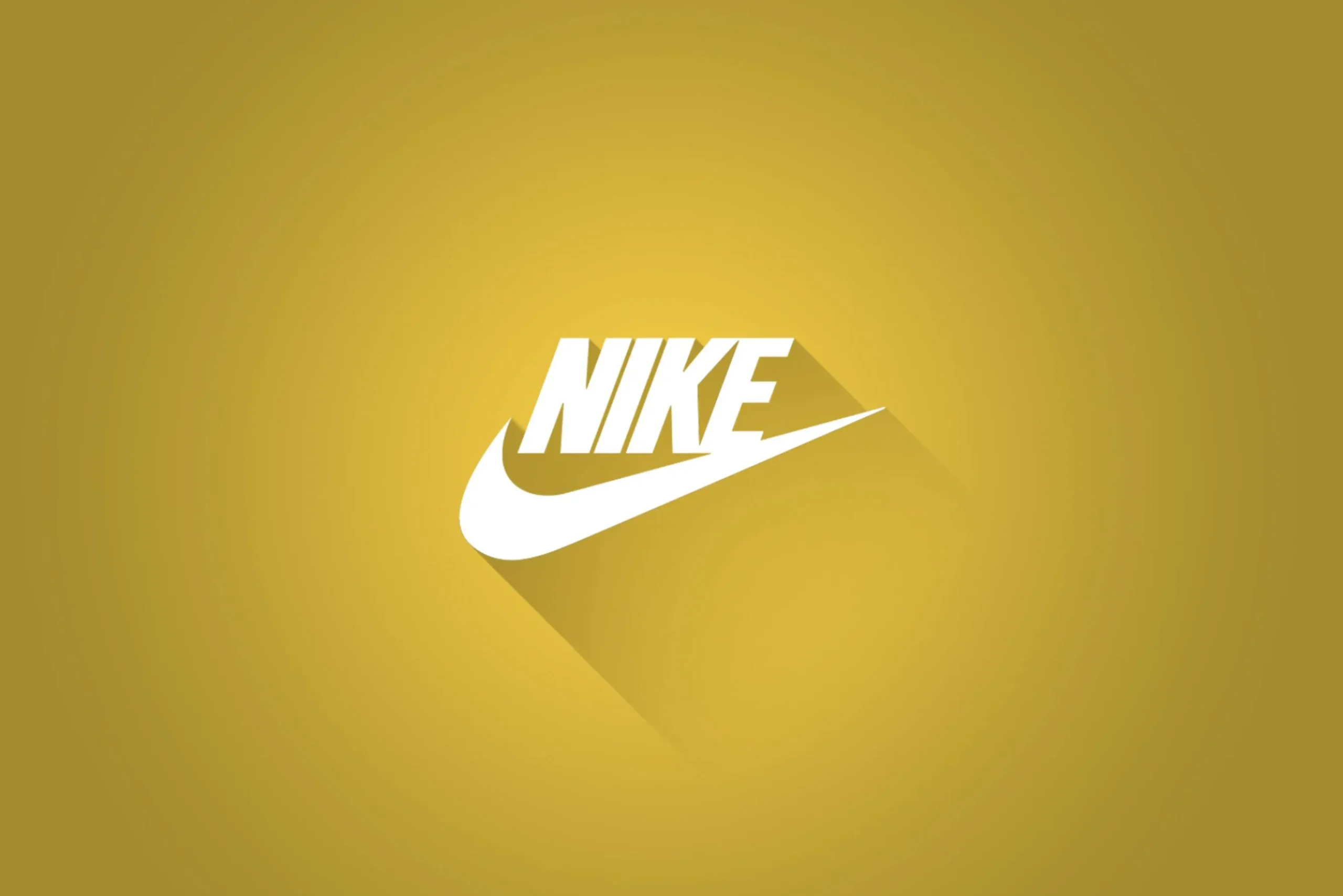
This brand for shoes, clothing and various sports equipment from the United States can also be an example of successful typography on packaging.
Nike’s fonts are also simple, with letterforms that tend to be firm and straight. However, the font chosen by the Nike brand has a strong character even though it remains simple.
As a result, the wider community is able to capture the image of the Nike brand that wants to be built, which is a sporty but dynamic product.
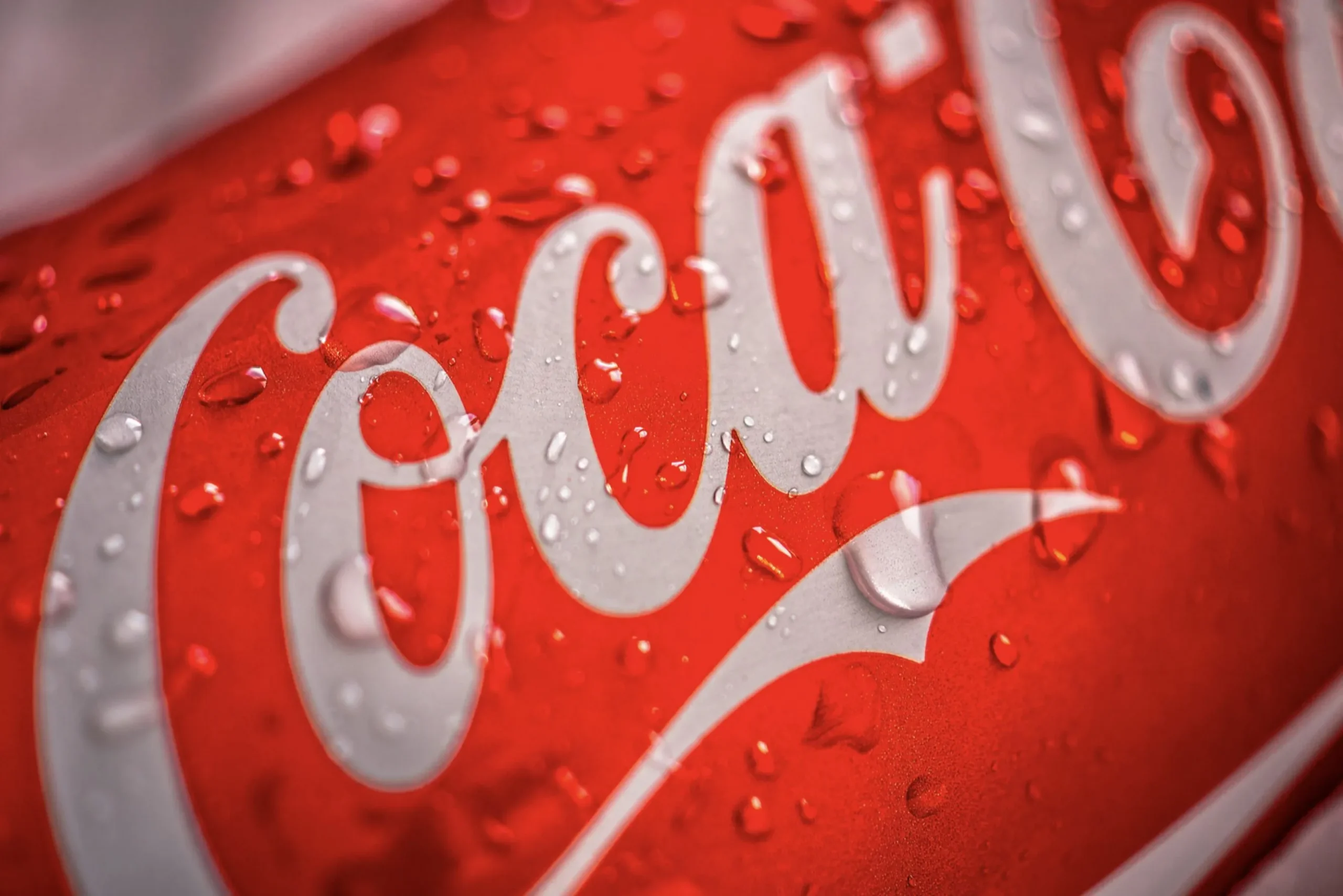
Next up is beverage packaging typography, namely Coca-Cola. This brand also has successful packaging typography. According to Logo Histories, the Coca-Cola text has been used since 1886, even though the patent registration was only in 1893.
From that period until now, Coca-Cola’s writing and name have never changed. The font shape is thick and rounded, with curves that make it unique and easy to remember and recognize.
Even the character that producers want to convey to their consumers if Coca-Cola is a fun and dynamic beverage product was successfully obtained.
So, what are the benefits of typography for packaging? With the proper use of typography, it is hoped that product packaging will be able to:
In order for product packaging to be attractive, it must fulfill the typography principles for packaging as follows, namely:
Manufacturers must be able to choose and use fonts that are easily read by their potential customers. Of course, this readability applies both at a distance and at close range.
The key to getting a typeface that fits this principle is to avoid choosing a font shape that is too decorative.
In packaging design, typography is the main medium for explaining to potential customers a product’s value or characteristics. Therefore, the selection of fonts must be in line with the product’s identity.
To make typography look attractive on a package, use different font sizes for various types of information.
For example, for product titles, you can use font size 14, then for product descriptions, use font size 12 and so on. By using different font sizes, it is expected that all the information you want to convey can be understood by consumers.
Besides, of course, the hierarchy of fonts will make the packaging look more beautiful and attractive.
This is not only related to the shape of the font but also to attractive product packaging, which must also pay attention to the composition of the use of colour.
Of course, a contrasting colour between the background and the text will improve readability and make the appearance more attractive.
Don’t forget to make sure the typography design also has enough space between letters so that the information can be read easily.
From the description above, typography for packaging is one of the essential elements that must be considered. Good typography will present complete information with an attractive appearance and be easy for potential customers to read.
Therefore, Twinletter provides a variety of typography fonts for affordable premium packaging. This guarantees that your product packaging will look more luxurious, unique, and ready to compete in the sales competition.
